Placement
Colour on the apples adds a rounded flush; higher colour can create a more lifted visual effect.
Cheek colour studio
Blush is as much about placement as colour. A soft flush on the apples of the cheeks reads differently from colour swept toward the temples. Preview both on the same face.
Try a blush look in the app →Preview the style on your photo, then decide.
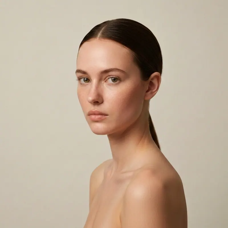 Visual example
Use a photo where both cheeks and the natural shape of your face are visible.
Try a centred flush, a lifted placement high on the cheekbones or a draped look toward the temples.
Compare a subtle wash with a bolder colour before deciding which feels wearable for your occasion.
Show both cheeks clearly. Choose a straight-on photo in soft, even light, with hair away from your cheeks. Heavy filters or existing blush make placement harder to judge. Keep the photo fixed while changing only the reference look.
Colour on the apples adds a rounded flush; higher colour can create a more lifted visual effect.
Rose, peach and berry tones shift the mood of the same face. Compare them with your lip colour in mind.
Cream and powder finishes can look different under light; a preview shows the styling idea, not the feel on skin.
The image is an approximation, not a colour-calibrated product test or a recommendation for a skin condition. Real texture, undertone and wear time depend on the product and your skin.
Yes. A clear reference look helps you compare placement and intensity on your face.
No. Lighting and camera processing change colour. Use the preview to narrow down a style, then check a real product.
An unfiltered photo in even light gives a more useful comparison.
Makeup studio
Start with a photo, then compare a specific product, eye shape or occasion. Each guide answers a different question.
All virtual makeup looks